In this installment, I’ll show the big and small changes necessary to upgrade this photo. It’s got your normal adjustments as well as some gradients and brushes.
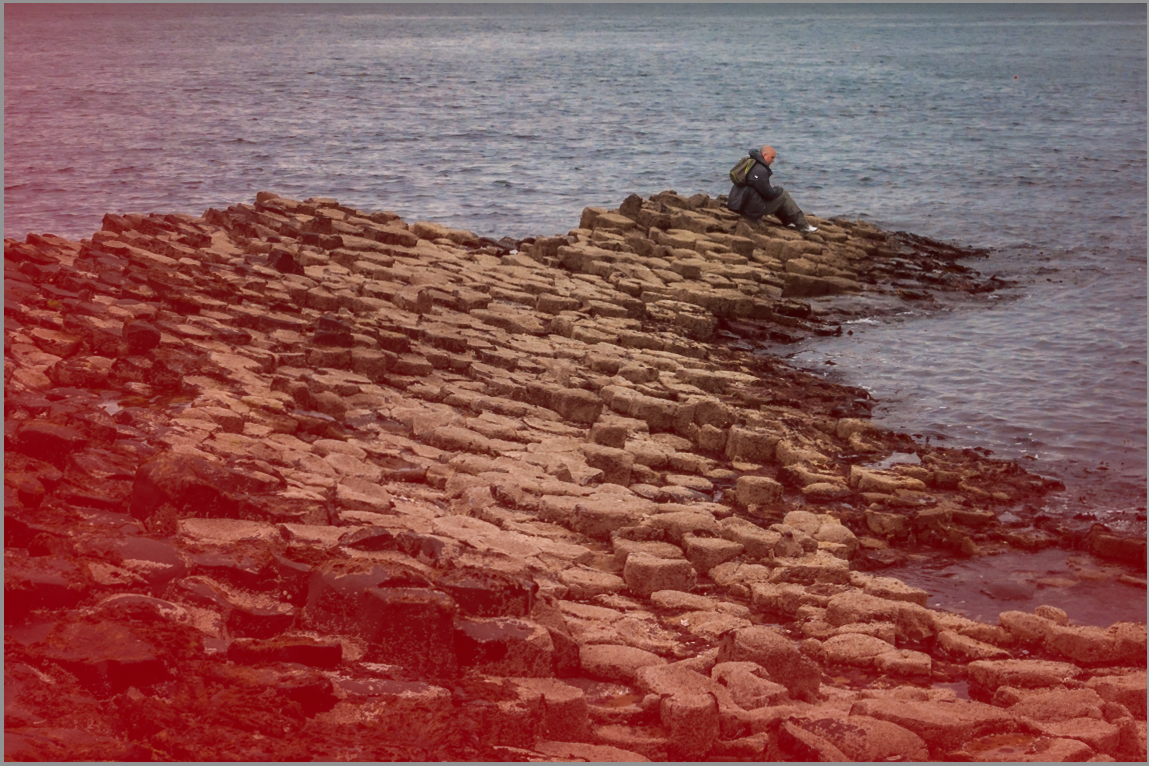
So here we start with the original picture:
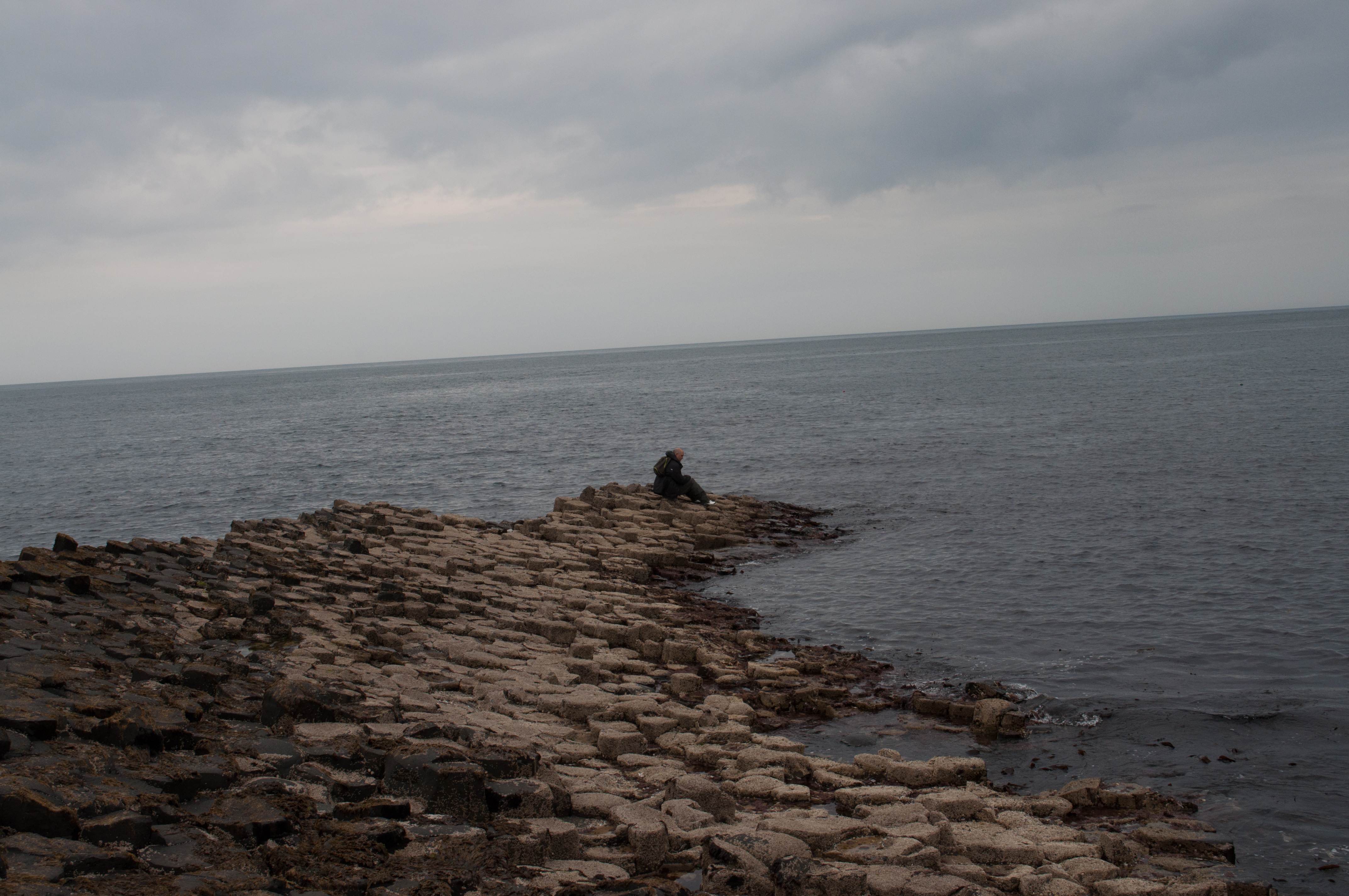
This one is so bad, I almost don’t want to admit it’s mine. Lets just pretend I slipped and was off balance when I took it. So the first thing I did was crop and straighten it. You’ll notice that I’m cropping away about 60% of the image. But if that’s what it takes to make the shot better, that’s what you have to do. The nice thing about cameras these days is that with all the megapixels, you can crop it substantially and still get a decent image. This camera has a relatively small 12.2MP sensor and even after this huge crop, I could print a 5×7 at more than 300 dpi and a 8×10 at 200 dpi.

Next, I applied a lens correction to adjust for any distortion (of which there is always a little) and correct any chromatic aberrations, if any. Then, I applied my basic settings. I brought the temperature up just a smidge and then lowered the exposure since it was a little bright. Next, I increased the shadows and lowered the highlights – stopping short of 100 to avoid a crispy image. I also raised the whites until they almost clipped and actually raised the blacks slightly, which is rare.

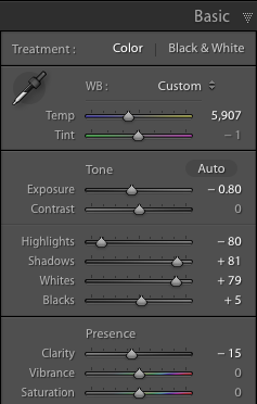
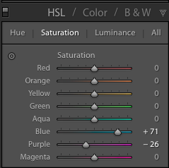
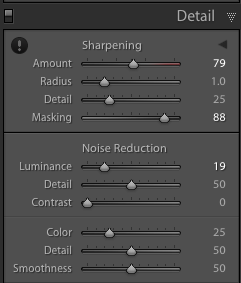
Next, I adjusted the HSL so that blues were just a bit more saturated and the water didn’t look grey. But this brought out a pink tone and I had to decrease the purple to account for it. Then I applied luminance noise reduction and sharpening, like usual.
Now, we’ve fixed all of the technical problems, but that doesn’t mean the photo is done. It had some problems. Firstly, the man on the ledge was a little dark, especially for a focal point. So I grabbed the brush adjustment, painted him, and increased the exposure a bit.
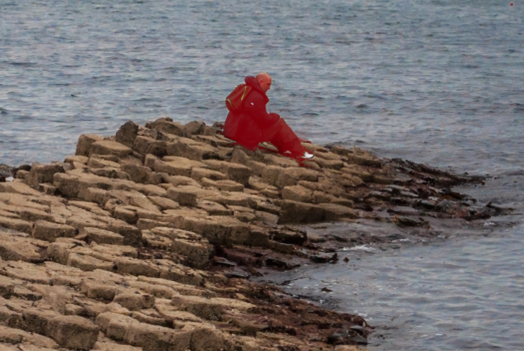
That fixed that problem, but I found that I was getting distracted by the foreground. I couldn’t crop anymore or I’d lose more of the cool rocks than I wanted to. First I applied a small vignette. Not enough that you actually notice it, just enough that it slightly guides your eye in. That helped but not quite enough. At this point I noticed that I didn’t have a very great depth of field since it was taken with an aperture of f/10. So, I used a radial gradient and applied it as seen below. I increased the feather so that there was a nice transition and put the center just above the guys head. In this brush I reduced the sharpness and clarity almost all the way. This blurred it just a little on the edges, which also draws your eye toward the man.
Overall, I’m quite happy with the changes and I think they really saved this from becoming just another boring shot of rocks. You can see the before (after cropping and lens correction) and after below.


a