
I’ve recently switched from Aperture to Lightroom and have been forced to learn a little about color spaces because of this. Today, I’m going to keep things simple and only talk about three different color spaces (SRGB, Adobe RBG, and ProPhoto RGB) and which ones you should use at each point of your workflow.
All jpeg images can represent the same number of colors. The color spaces determines the range of those colors. How and why aren’t really important here since this post is about knowing which to use. Below is an image showing the shape of human vision as well as various color spaces. You’ll notice that sRGB is the smallest of these, Adobe RGB is in the middle, and ProPhoto RGB is the largest.
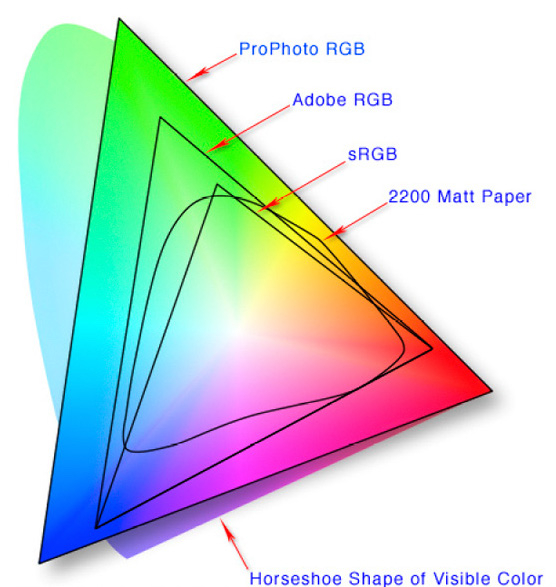
sRGB was developed by Microsoft and HP in 1996 and has since become the defacto standard with endorsements by a lot of the industrial players. The downside is that it has the most limited range of the three. The upside is that almost every device made supports it and knows how to read an sRGB file correctly. In fact, most web browsers will just ignore whatever color space you embed in your image and interpret it as sRGB no matter what. Adobe RGB has a significantly larger range, but it isn’t supported by nearly as many places, especially online. ProPhoto RGB is the largest of the three and can accommodate about 90% of human vision, although it does bleed over into imaginary colors a bit. This is the most limited of the three and you’ll usually only find support in high end photography applications like Lightroom and Photoshop.
So which should you use? Obviously, whenever you export an image for the internet, you should export it with the sRGB color profile. It won’t have quite the range as when you were working on it in one of the other color spaces, but this guarantees that a web browser won’t make it funky. So, is the answer to just work in sRGB all the time? No, for two reasons. Firstly, Lightroom automatically works int he ProPhoto RGB color space and there is no option to change that until export. Secondly, I don’t want to limit myself when I don’t have to. And if I wan’t to print some of those images, I might want a different color space. The print lab that you use will let you know what color space to export in, but it will usually be sRGB or Adobe RGB.
My montra is: more information is always better. So I work in ProPhoto RGB and then export to the other two whenever I need to for a particular reason. And I’ve changed the settings in my camera to use Adobe RGB for jpegs in case I need the jpeg and also because the histogram is based on the jpeg data. I’d use ProPhoto RGB there too, but cameras only have sRGB and Adobe RGB as options. To export with a particular color space from Lightroom, click File then Export and about halfway down the popup you’ll see the section below, which allows you to select from ProPhoto RGB (the default), Adobe RGB, and sRGB.

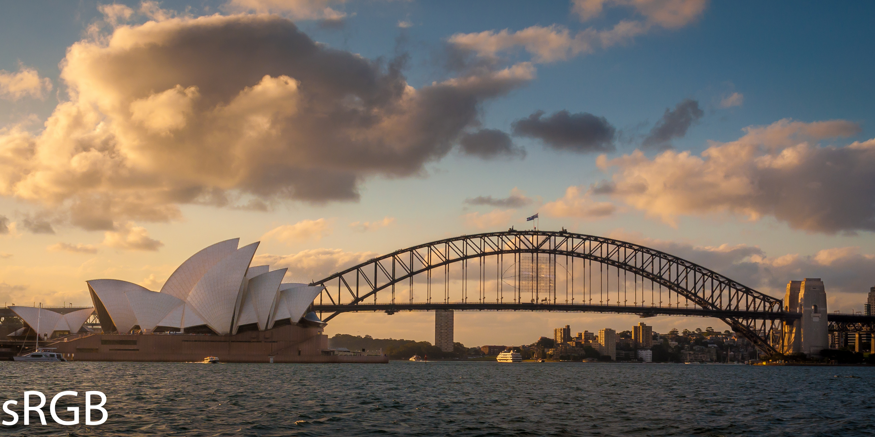
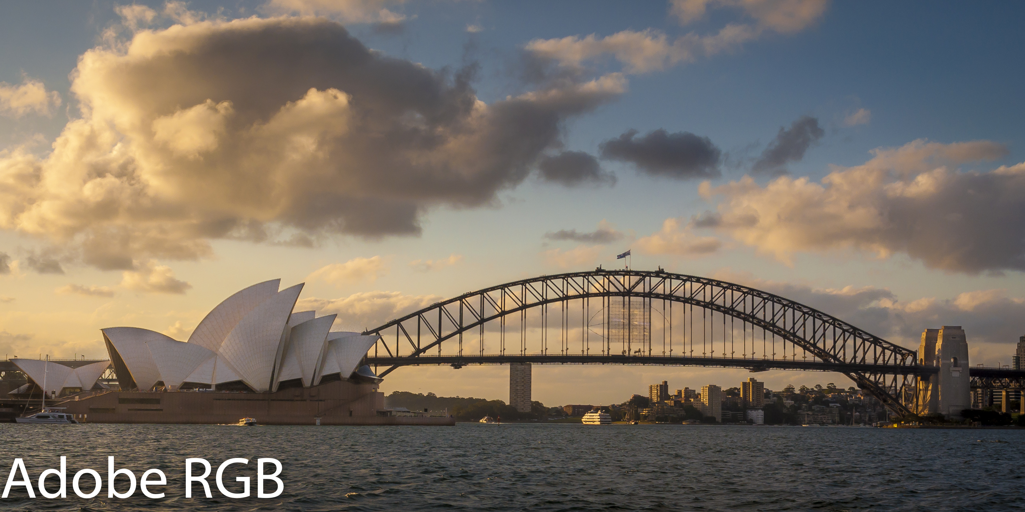
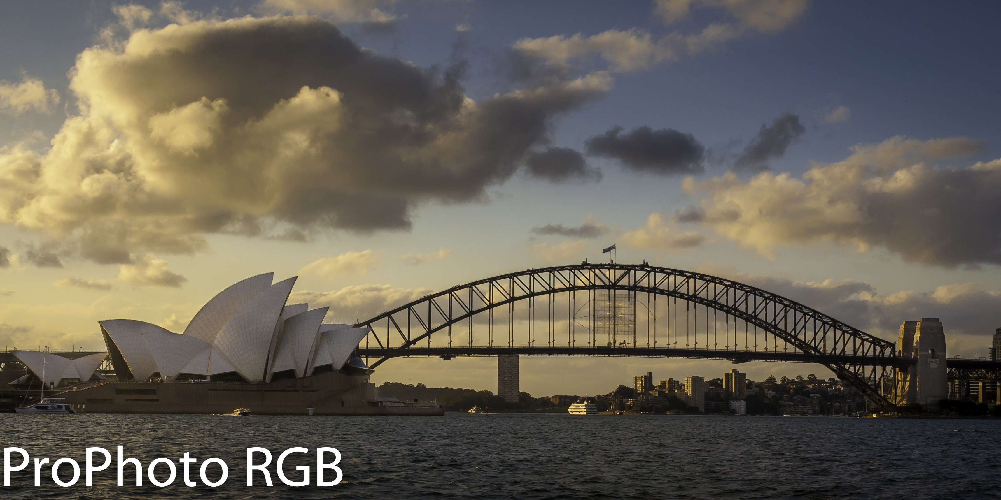
Below is the same image exported as a ProPhoto RGB, Adobe RGB, and sRGB so that you can see the difference. Remember that your browser might be ignoring the color space embedded in the image and interpreting them as sRGB.
EDIT: Something interesting happened when I went to this page on Chrome. The images appeared correctly! Turns out some browsers have finally come around and added color management so that they read the color profile and show it correctly. However, not all browsers do this, so I’d continue to output as sRGB for the web. A good site with info about this is here.
Other good links on this subject: PetaPixel, Fstoppers, Wikipedia, Cambridge in Color, SmugMug, and Martin Bailey Photography
.a


One thought on “Export to the Correct Color Space from Lightroom”